Aa
PrimaryMorganite
Used for titles and headlines
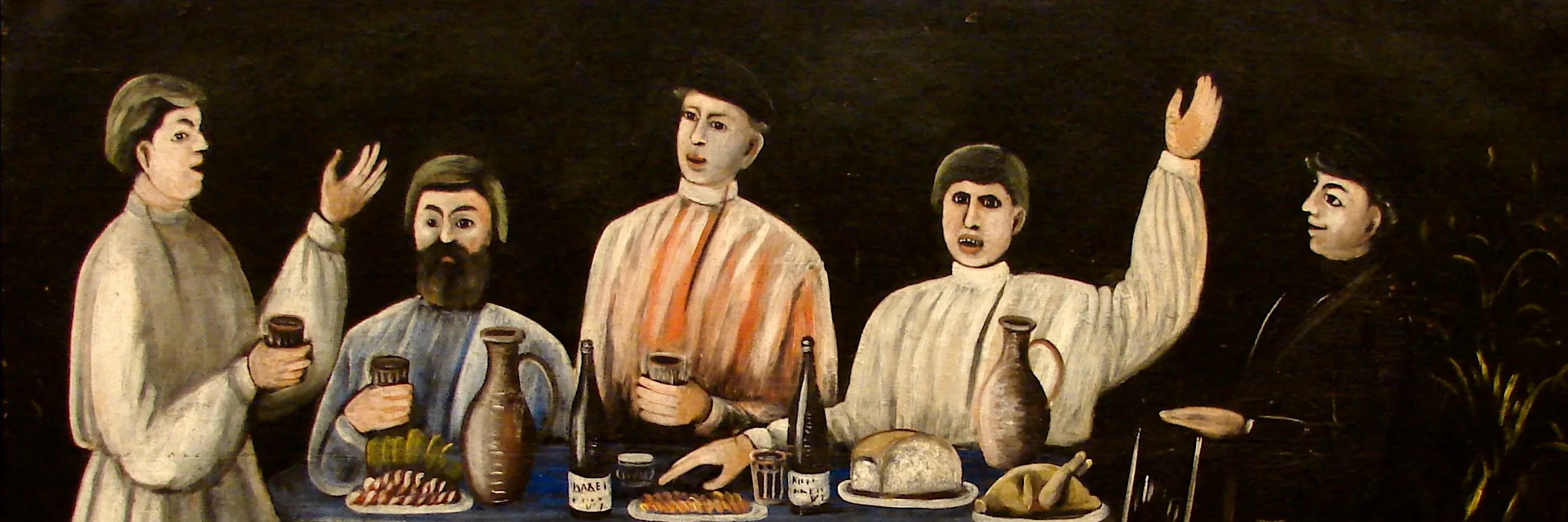
Badagoni approached us to design a label for a new product launching in the German market under the BEBU brand.
The goal was to create a visual concept that reflects the wine’s Georgian heritage while feeling natural and appealing to a German audience.
The result is a distinctive, modern identity that balances authenticity with a contemporary look.
Sector
Branding
Client
Badagoni
Country
Georgia
Expertise
Strategy, Branding

PrimaryMorganite
Used for titles and headlines
SecondaryPoppins
With its wide, open letterforms and high x-height, it was used for smaller body text
Основной
Вспомогательный
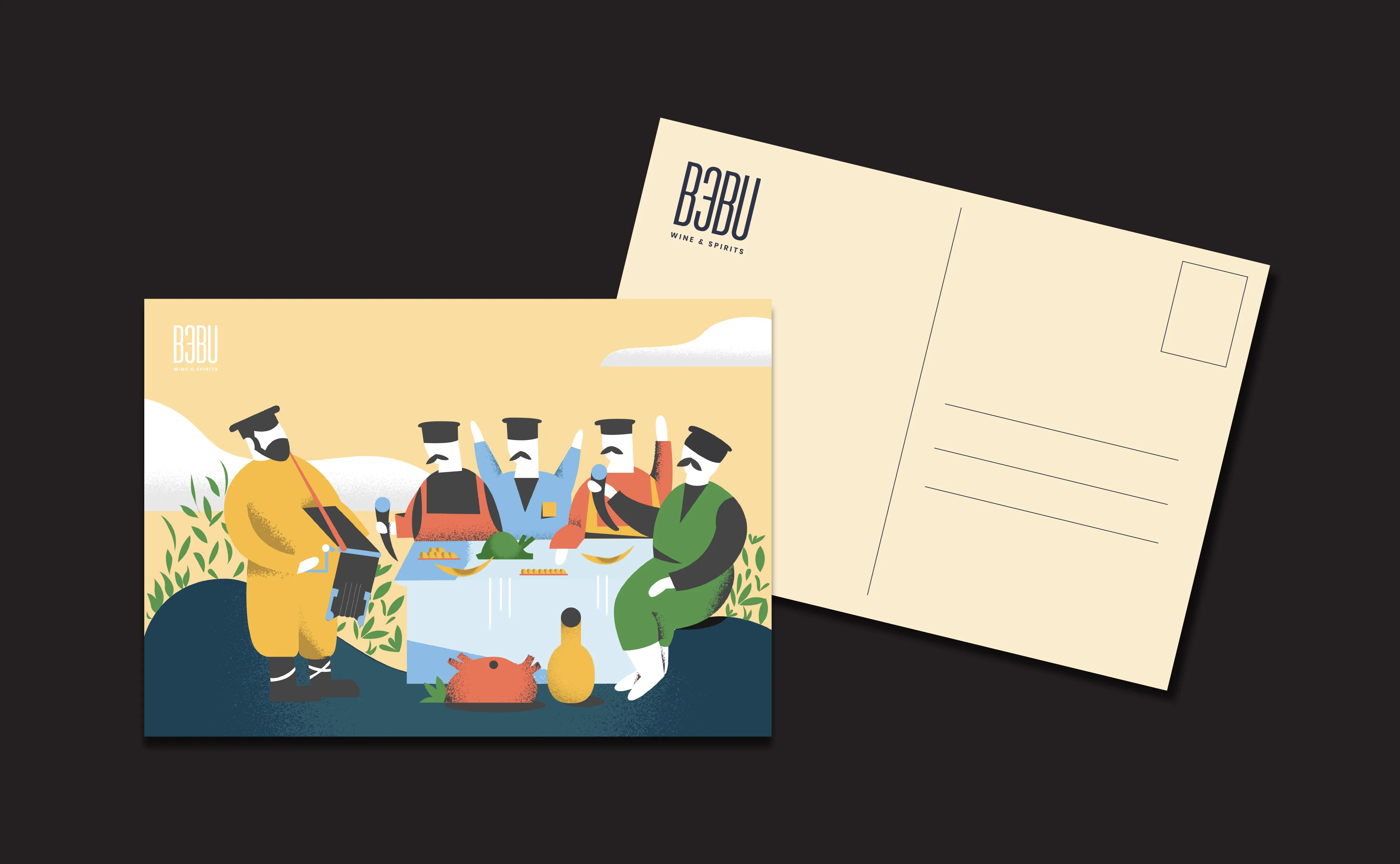
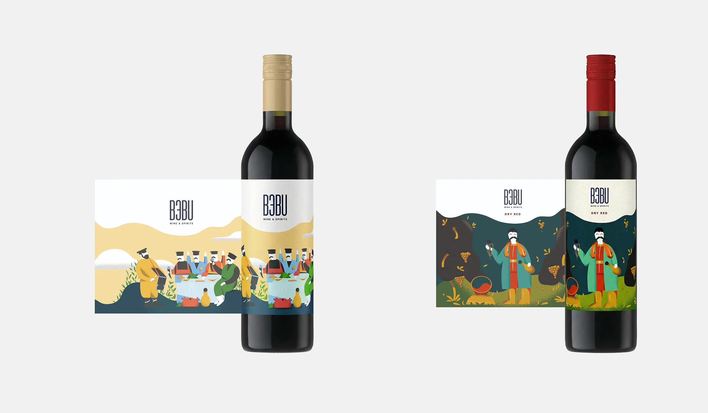
The BEBU brand received a visual identity that acts as a bridge between Georgia and Germany — conveying the essence of Georgian wine in a form that resonates with a European audience.
The project also reinforced Badagoni’s positioning as a producer capable of delivering products that meet international standards in both quality and design.